Dashboard — real-time visibility
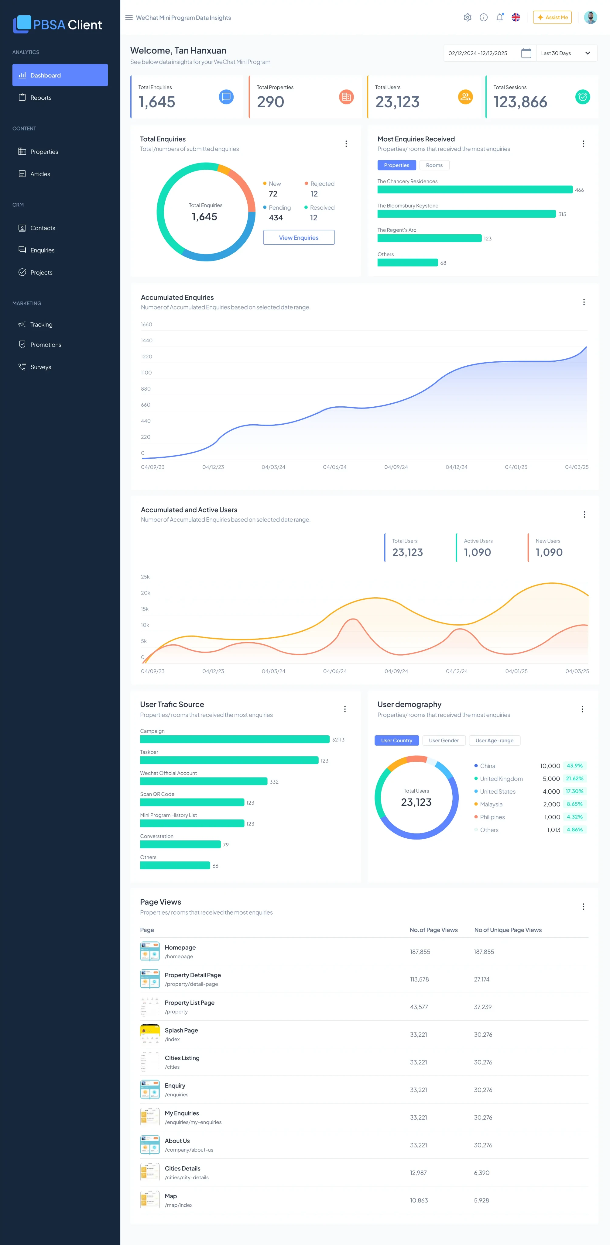
I shipped four KPI cards. Only one mattered.
Managers needed to see what was happening across their student accommodation portfolio in real time. No more chasing data through Excel and WeChat. One dashboard, one source of truth.
I designed a dashboard with four KPI cards. Stakeholders asked for all four. I shipped all four. Post-launch, I discovered only one was actually useful for daily operations.
The assumption
Stakeholders said they needed visibility into four numbers. I assumed all four mattered equally for daily decision-making, so I designed them with equal visual weight — and shipped them.
- Total Enquiries Operational — what's coming in.
- Total Properties Portfolio size.
- Total Users Platform scale.
- Total Sessions Traffic volume.
This was my mistake.
What actually happened
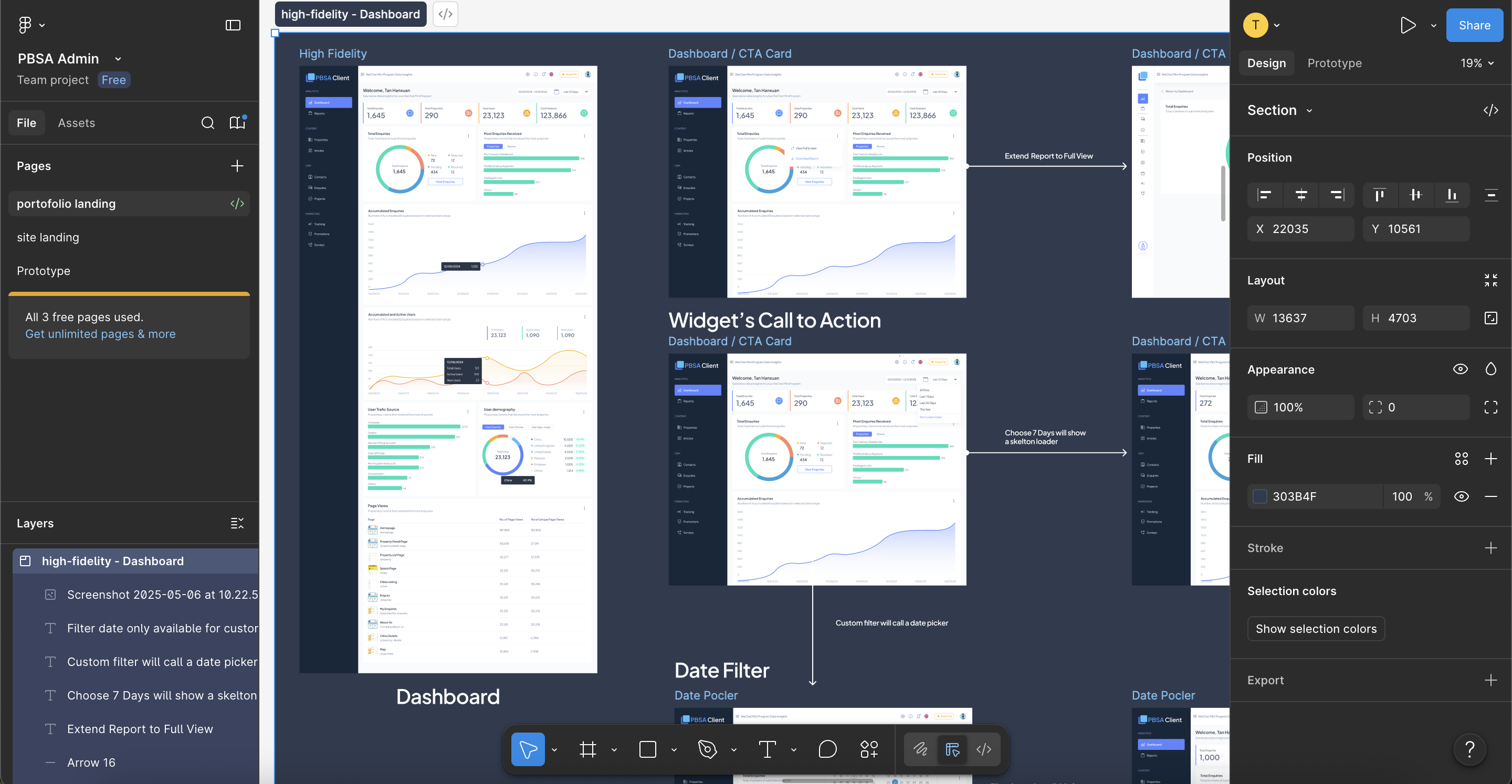
Post-launch, I watched how managers actually used the dashboard.
- Total Enquiries Checked every morning. Drove daily prioritization. A real operational metric. Used daily
- Total Properties Rarely checked. Doesn't change often. Nice-to-know, not need-to-know. Rarely used
- Total Users Never checked by operators. A leadership metric, not an operational one. Never used
- Total Sessions Never checked. Too abstract for day-to-day work. Never used
Reality: one of four metrics was actually valuable for the people using the system.
What I'd do differently
Before designing any dashboard, ask three questions:
- Who is the actual user?
- What decision are they making?
- What metric changes their action?
For this dashboard, I should have asked: "Jeff comes in at 8 AM. What's the one number you check first?"
"How many enquiries came in overnight?"
Everything else was secondary.
What actually worked
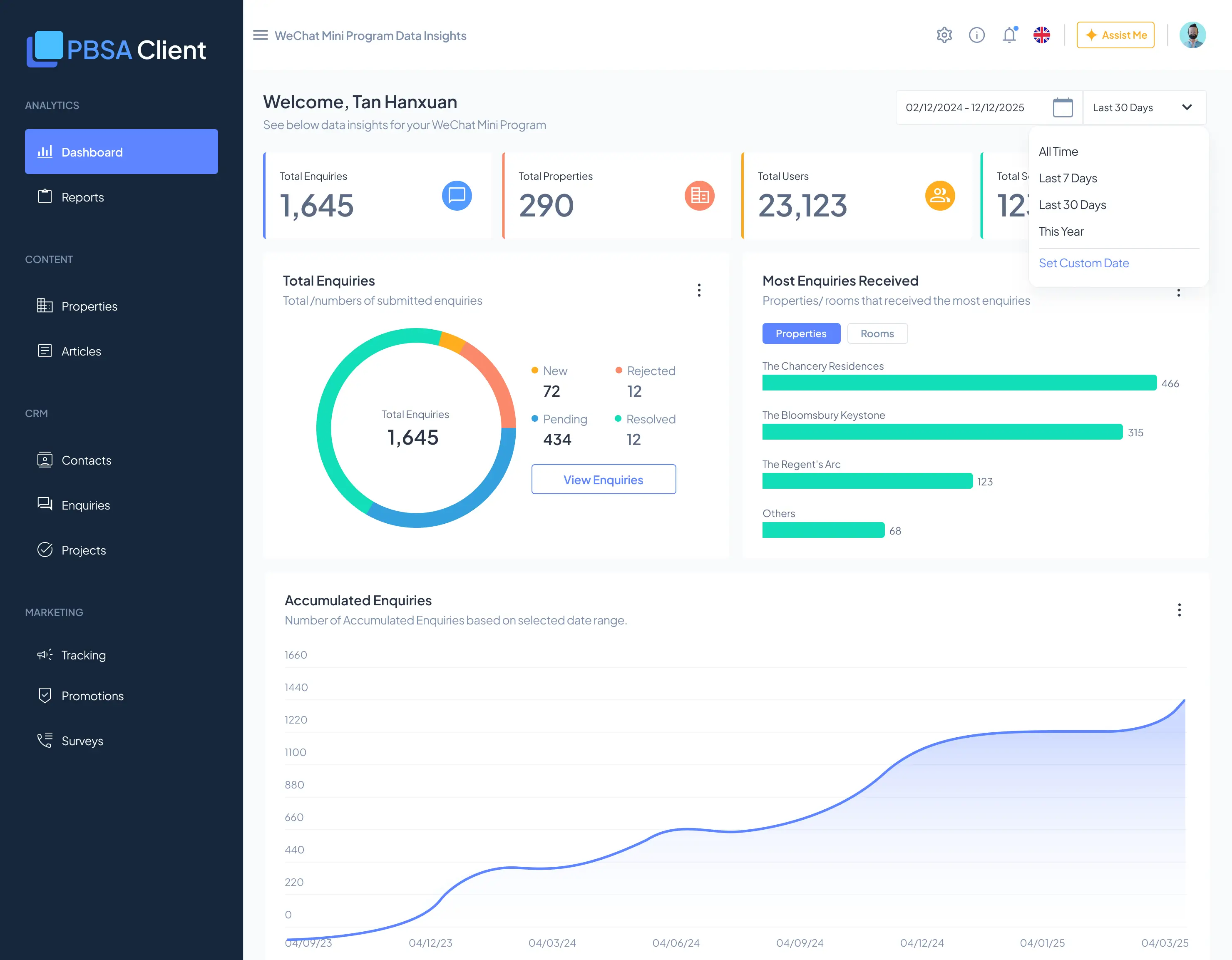
The visualizations. The enquiry trend line, status-breakdown donut, and property-interest bar chart all worked well. These were exploratory — they answered "why" and "where," not just "how many."
The filters. Date range, property, and status tabs let users drill from summary to detail quickly.
The drilling. A "View Enquiries" action on each chart let managers move directly from insight to action. These pieces supported real workflows — I'd keep them.
- Design systems
- Each KPI card was built independently by different developers, with different spacing and sizing. Consistency slipped because no component library was enforcing the standard.
- Validation
- I shipped and learned instead of talking to users first. The four-KPI decision cost me because I never asked "who uses this, and for what?"
- Strategic thinking
- I conflated stakeholder requests with user needs. They're not the same. Stakeholders asked for four metrics because they thought they needed them. Users only needed one.
The honest take
This module taught me the difference between two things:
- Executing a request
- I did this well — the dashboard is clean, functional, and complete.
- Solving the right problem
- I didn't do this — I never validated which metrics actually mattered.
A better approach
- Ask operators: "What's the one number you check first?"
- Validate that assumption with 2–3 conversations.
- Design the dashboard to make that number primary.
- Add exploratory layers below — trends, breakdowns, drill-downs.
- Ship with confidence.
Instead, I shipped and discovered. Post-hoc is expensive.
What's here now
The dashboard works. Managers use it daily, the enquiry metric is valuable, and the exploratory visualizations support follow-up actions.
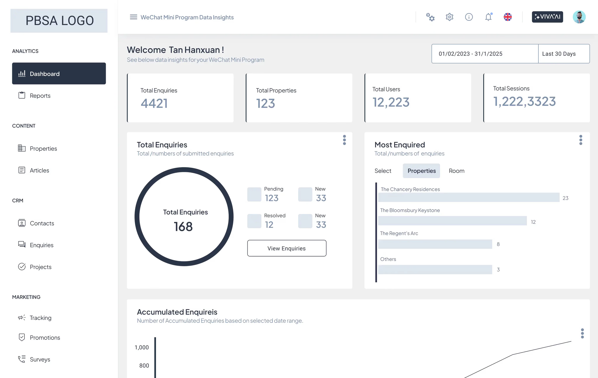
But it carries unnecessary cruft — three KPI cards that don't serve daily operations and just add cognitive load. If I were redesigning it today:
- Primary
- Enquiry volume, with the overnight change highlighted.
- Secondary
- Status breakdown — what's the backlog?
- Exploratory
- Top properties, trends, and filters.
- Remove
- Properties, Users, and Sessions counts — moved to a separate "Business Metrics" view.
The gap I'm closing
This module showed me what happens when I skip lightweight validation. I can execute beautifully — but execution without validation means shipping features users don't need.
What I'm building into my practice:
- Talk to users before finalizing designs.
- Ask "who uses this, for what?" as a standard question.
- Validate with conversations, not post-launch metrics.
- Design based on observed behavior, not assumed behavior.
That's the gap I'm trying to close.